LLM Evals Course Lesson 7: Interfaces for Human Review
Notes from lesson 7 of Hamel and Shreya's LLM evaluation course - interface design principles and strategic sampling.

- David Gérouville-Farrell
- 7 min read
The seventh lesson of Hamel Husain and Shreya Shankar’s LLM evaluation course covered interfaces for reviewing LLM outputs. This builds on Isaac Flath’s vibe coding sessions, but focuses on design principles rather than implementation.
The Review Bottleneck Problem
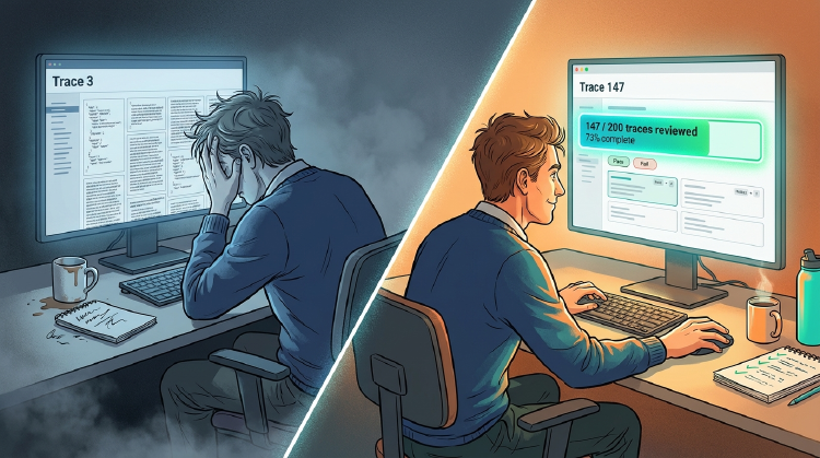
People talk a lot about AI doing more coding, pushing humans “higher up the stack” to do review instead of implementation. But review is already a massive bottleneck. I don’t want to manually examine 10,000 agent outputs one by one.
The shift towards review-heavy workflows needs dramatically better tools. Probably some new paradigms. I’m not convinced current approaches scale to what we’re being asked to evaluate.
Whilst it’s easy to say code your own interfaces for your evals, I was curious for this lecture because I was eager to learn from Shreya’s extensive experience in the area.
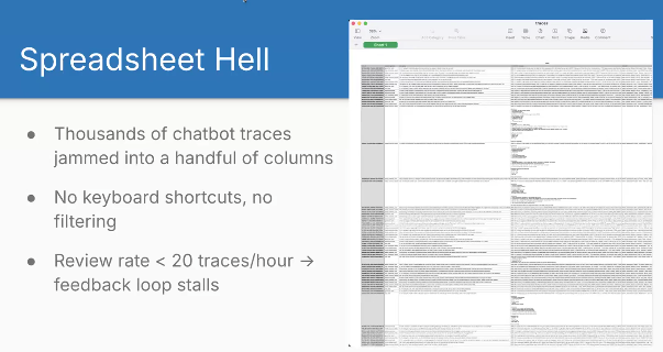
Spreadsheet Hell
Shreya showed an example of “spreadsheet hell” that matches my experience. Walls of text crammed into cells. Constantly adjusting column widths and heights. Double-clicking to expand cells. Scrolling through JSON that should be rendered properly. It’s a total pain having to view complex rich data inside a spreadsheet.
Custom Interfaces == Increased Throughput
Shreya said custom interfaces give you 10x review throughput compared to spreadsheets. She mentioned reviewing 200 traces per hour with good interfaces.
In my experience working with subject matter experts, we’d typically review about 20 traces per hour in spreadsheets. So 10x feels about right to me.
You can build these interfaces in about half an hour with vibe coding. The time investment pays back almost immediately on any serious project.
Nielsen’s Usability Heuristics
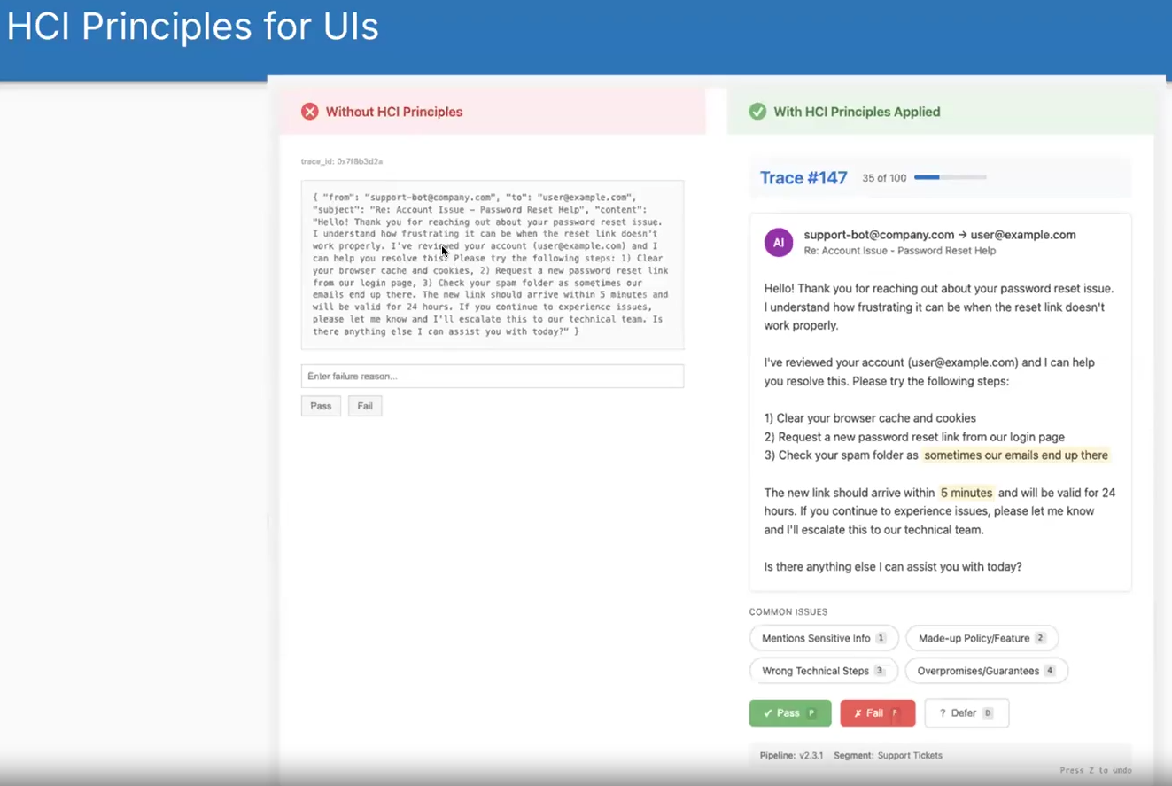
Shreya showed this before and after of what it’s like to look at raw JSON versus a nice custom interface. I built data munging scripts to convert JSON into CSV with everything in its own cell. Still painful. Spreadsheets weren’t designed for this type of data review.
Shreya referenced Jakob Nielsen’s heuristics from 1994:
- Visibility of status: Show trace numbers, how many reviewed, how many remaining
- A progress bar really motivates people to finish
- Recognition over recall: Pre-filled failure mode options instead of making users remember and type them
- You don’t want people to have to think about how to do it, they should just look at it and understand it
- If you pre-fill failure modes, people can just click on them rather than remembering what the failure modes are and typing them in
- Match the real world: Domain-aware views (emails look like emails, code looks like code)
- User control: Hotkeys, undo, defer for uncertainty
That last one about deferring for uncertainty reminds me of the old exam advice: don’t get stuck on a difficult question, move to the next one and come back later. When reviewing LLM outputs, if you hit an edge case you’re unsure about, defer it. By the time you’ve reviewed everything else, you’ll have better intuition for that difficult case.
I taught interface design and usability back in 2011-2013. Covered Nielsen’s heuristics in my lecture on expert evaluation and his broader framework in my lecture on usability and layout. Once you start viewing interfaces through these lenses, they help with everything you build.
In my usability teaching, I also covered Nielsen’s 2003 usability attributes, which apply here too:
- Learnability: How quickly can someone start using it?
- Efficiency: How fast can experienced users work?
- Memorability: Can users return after time away and still use it?
- Errors: How many mistakes and how easily can they recover?
- Satisfaction: How pleasant is it to use?
These directly impact whether your team will actually use the interface or find excuses to avoid the work.
Speed and Accuracy Boosters
At this point, this is where the lecture actually got pretty valuable for me. As mentioned earlier, the idea of building custom interfaces has come up a few times in the course. From this point, Shreya started sharing her own actual experience and I thought these were all pretty useful.
Single-trace canvas: Most time gets spent in single-trace views rather than batch views. Make this view clean and focused.
Pass/fail in one key press: Tag chips that auto-select on number keys. Move quickly through common judgements.
Progress bar: People complete more when they can see progress. In early user studies without progress bars, people would review 3-4 traces then stop. With a progress bar, they pushed through to completion.
- ↑ I really like this one, I hadn’t thought of that and it’s really cool
Batch-label similar traces: After multiple rounds of error analysis, cluster similar traces and batch-apply labels. Only do this after you understand the patterns.
Context ribbons: Show pipeline version, user segment, previous automated judge verdicts. Helps reviewers make decisions without hunting for information.
LLM-as-judge assistance: Use judiciously. Having an LLM flag potential instances in a long document saves hunting. The human still verifies. Don’t use this in your first interface version.
Strategic Sampling
This is my favourite part of the lecture and one of my favourite parts of the whole course actually. These specific things are not things that I already had in my mind and it shows the difference between somebody who’s done some work in this space and somebody who’s spent a significant part of their career focusing on this problem. I really love these.
Reviewers have limited bandwidth. You can’t examine everything. Which traces should hit your interface?
-
Limited reviewer bandwidth
- Aim for about 100 traces per week, not your full log stream
-
Random sampling
- Unbiased health check of overall quality. Essential for understanding baseline performance
-
Uncertainty sampling
- Select traces where automated judges disagree or have low confidence. Surfaces edge cases efficiently
-
Failure-driven sampling
- Include guardrail violations, exceptions, user-flagged bugs. Your highest severity items
-
Blend the queues
- Mix these approaches. For instance: 20% random, 50% uncertainty, 30% failure-driven. Regenerate a fresh batch daily
The blending approach addresses multiple problems simultaneously. You don’t need to be the person who figures out your system can’t handle edge cases because uncertainty sampling surfaces them automatically. You don’t need to discover high-severity bugs in production because failure-driven sampling surfaces them immediately.
This is why courses like this have value. You can think hard about evaluation and figure some of this out yourself, but having someone share their battle scars saves time.
Case Study: EvalGen
EvalGen was one of the first interfaces built specifically for LLM evaluation. The paper describes the system.
- Criteria drift matters more than anticipated
- What users think counts as “good” evolves as they see more examples
- Progress bars proved crucial - without them, people reviewed a handful of traces then stopped
Case Study: DocWrangler
DocWrangler addresses making sense of unstructured documents at scale. The paper details the approach.
- User studies revealed people found specification issues within just 5 open codes
- The system emphasises prompt versioning and maintaining history
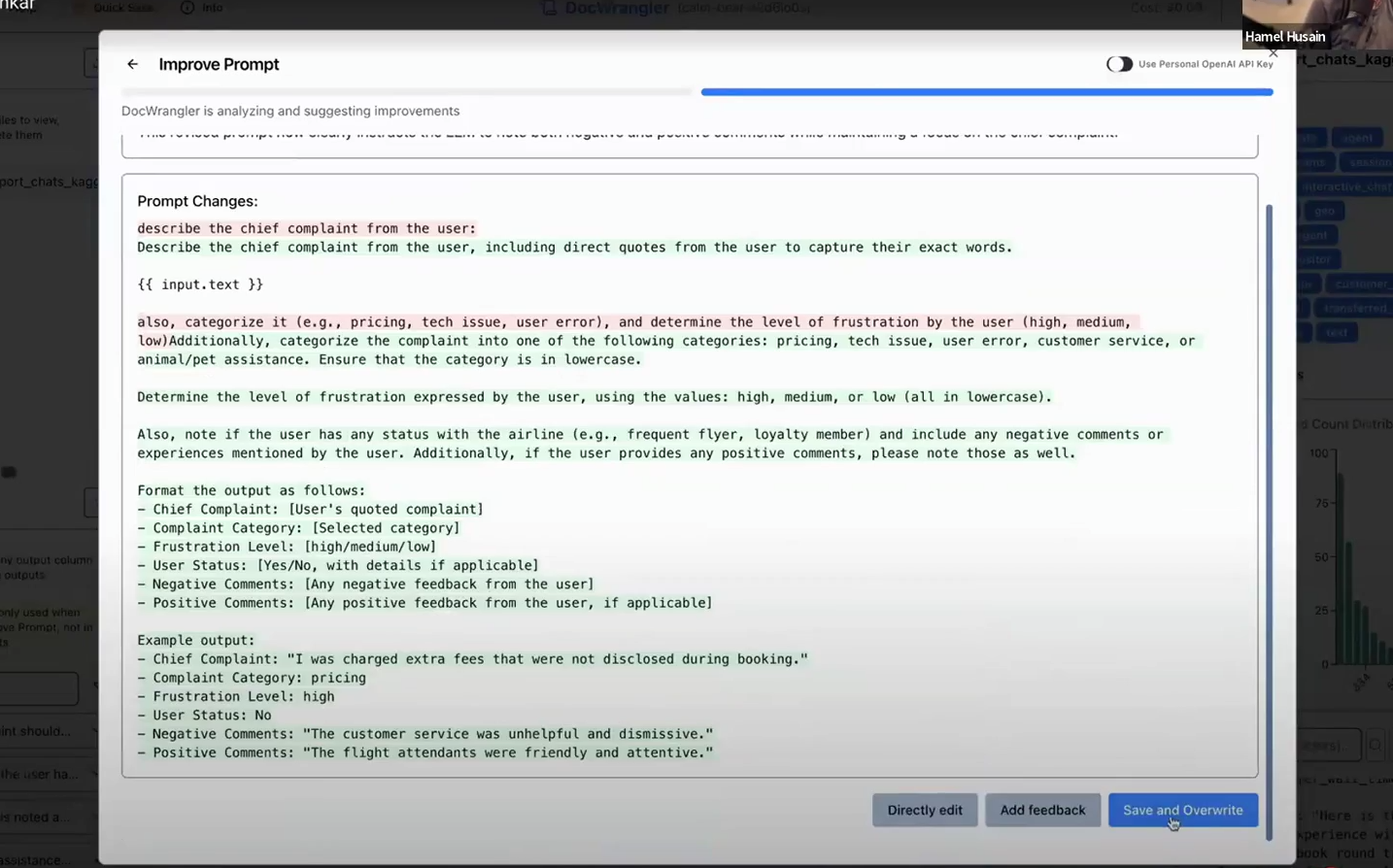
DocWrangler includes a feature where you can accumulate open-coded feedback across examples, then click a button to generate an improved prompt incorporating that feedback. The interface shows a diff of changes and maintains revision history.
I’m quite uncomfortable with the idea of automatic prompt improvement. Every time I’ve experimented with tools that do this, they end up adding things to prompts I don’t approve of - unnecessary verbosity, hedge words, or structural changes that don’t match my intent. The key word here is “automatic”. I’d only ever use this kind of feature if I could review the suggested changes before accepting them.
The screenshot above shows a decent approach. By showing the diff directly, you can see what is being changed and edit it if you don’t like it.
Shreya’s Learnings
- Rapid iteration matters: prompt updates should take minutes, not hours
- People find specification issues within approximately 5 open codes
- Versioned prompts and label history prevent loss when criteria drift
- Interfaces should close the loop - feedback should improve outputs directly
- Once specification is addressed, shift to systematic evaluations for generalisation issues
thingsithinkithink
-
One thing I don’t love about the course is that the information density isn’t consistent. There’s so much value in the first couple of lessons, but we don’t necessarily need to keep talking about custom interfaces quite so much. That said, I did really enjoy the usability guidance in this one.
-
The problem of handling and reviewing large quantities of outputs from LLMs or other AIs isn’t going away. I think we need even more revolutionary approaches than these ones. But these are a good start.